Friday, 21 March 2014

Evaluation - Question 4

How did you use new media technologies in the construction and research, planning and evaluation stages?

Research:
  • Internet - We used YouTube to look at videos from similar artists to our chosen artist.

When we were researching similar artists and other information about our own chosen artist etc., the only media technology we used was the internet, as we used several information websites to obtain the necessary information for our video planning. Information websites such as Wikipedia.com and other artists websites, and video sites such as YouTube give us access to any information we need, whenever we need it. These websites enables us to gain access to a virtually unlimited information about any topic we needed to find out about, and we were able to find out large chunks of information about our chosen genre and similar products, more through YouTube as we were able to watch any videos that linked to our product, as we wanted.


One advantage of using the sites that we used for our research was that they are accessible from any computer at any location, which means we could do our research whenever we wanted, providing there was internet access. One disadvantage of the sites we used was that they can be quite unreliable, especially Wikipedia, as anybody can go onto it and change the information, so we needed to make sure that our information was totally correct, which is why we used a variety of different websites.

Planning:
  • Internet - We used email to contact the record company/searching up sunset times for our filming.
  • Photoshop - We used this to make rough designs for our dikipak and poster.
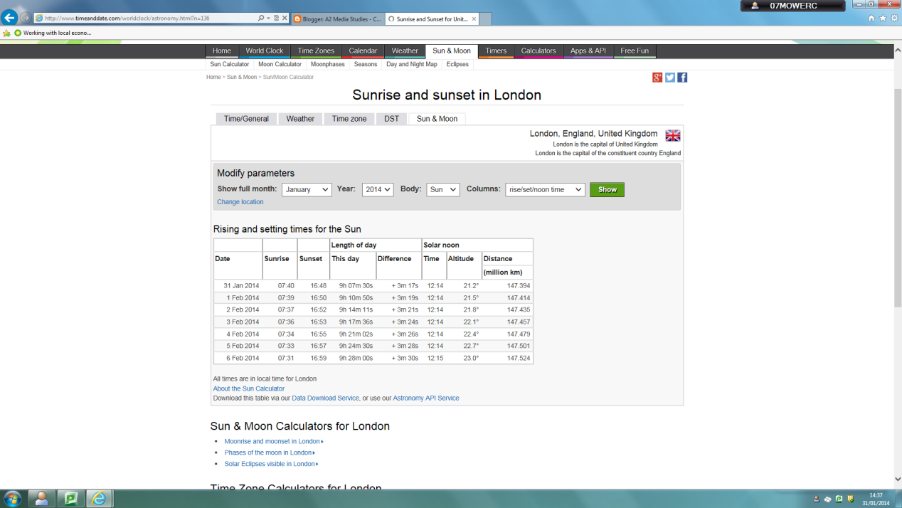
We used sunset/sunrise timing website so we could see what time we needed to film when doing our performance shots, as we needed to get the sunset in the background, so this website enabled us to make sure we filmed in time and not miss the sunset that we want. This helped us a lot whilst creating our media text as it enabled us to plan in advance for what times we needed to start filming, and what times we needed to be finished by, in order to get the best, most appropriate sun light possible for our video.



During the planning stages of creating our media text, we had to ask for permission from our chosen artist's (Josh Record) record label, which in our case was Universal Music. This meant we had to use the internet to access emails and conatct Universal Music as a company and ask for permission to use a song by their artist.


We also used programmes such as Paint and Photoshop to create ideas for our digipak and poster. We used Paint whenever we had a rough idea and we just wanted to see what it would look like, then we used Photoshop if we all liked the idea and actually thought about using it, as Photoshop has more tools to help make a better poster, for example colour corrections etc. Programmes like Pain and Photoshop were perfect for us as they are not too complicated to understand, yet they still allow us to create professional looking ideas, more so on Photoshop than Paint, but they both enabled us to play around with ideas until we decided on a design that was most appropriate for our genre and song choice.


Construction:
  • HD camera - This was used to film all of the shots for our video.
  • Computer - This was used to edit the video to make it how we wanted it to look. We used iMovie for the rough cuts, and for our final piece we used AECS6.
  • Photoshop - We used this to create pictures for our magazine and digipak and add any effects onto pictures if we needed to.
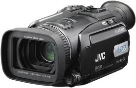
We used a HD camera to film all of the shots that we needed to make our video. The camera was provided to us by our school's Media Studies department. After filming all of the shots that we needed, we then uploaded them onto a computer, where we would then edit all of our clips. The camera we used to film was a very good quality and had all the appropriate equipment with it to enable us to get the best quality shots that we possibly could. For example, the camera also came with a tripod and a dolly. These items made it easier for us to get a wider range of shots as the dolly helped keep the camera still when filming still shots and the tripod helped us to move the camera without shaking it when we did some of our movement shots.



The computer enabled us to put our shots in the order that we wanted them, and do anything else with them that we wanted. On the computers, we used iMovie to create any videos we wanted. We chose to use iMovie rather than Final Cut because although iMovie is more simple than Final Cut, it still has all the necessary functions on it that can help us make a very good video.


We used Photoshop to complete any designs we had for our digipak or our magazine article. We used Photoshop because it has the appropriate tools on there to enable us to make a professional looking design, and it isn't too difficult to learn how to use.


Evaluation:
  • Internet -
For my evaluation, I used several websites to help me write it out. The main site I have used is Blogger, as the evaluation questions all need to published onto my Blogger account, meaning anyone who needs to can have access to it whenever they want. I also used Blogger to find out certain information about my research and planning, for example what we researched, how we did it etc. as one of the questions for my evaluation was linked to my research and planning; therefore I needed to look back at it.


I have also used YouTube when doing my evaluation, as the questions are linked to my G324 task (music video), and I often needed to refer to my G324 task to help me find appropriate answers for the questions.

Evaluation - Question 3

What have you learnt from your audience feedback?

The audience feedback that we have received from our teacher and fellow students has been very helpful when working on our improvements. Each person who has watched each rough cut has given us 3-4 comments, some have given even more. The comments were both positive and negative, which helped us more as we could then see what elements of the video were popular with other people, and what bits weren't as popular and needed changing.

For our first rough cut, the majority of people said that our jump cuts didn't look particularly good and they didn't fit the beat of the song like our other shots did; therefore we got rid of one of our jump cut scenes, and we changed our other jump cut scene by adding a transition to it (cross fade) instead of getting rid of it completely, because unlike the other jump cut scene, this one was necessary for the narrative and getting rid of it would ruin the story, whereas the other was not totally needed in the video and we could easily replace it with another shot.  


The editing process for rough cut two involved us taking out the parts from rough cut one that weren't popular with the rest of the class, and either changing them to make them look better, or replacing them. We then showed our second rough cut to the class and got feedback for it.


Generally for rough cut two, the comments were more positive on a whole, however there were still a few elements of the video that a lot of people picked up on and said that we should change. For example, one comment that was said frequently is that we should remove some of the shots that look very dark, like the several of the performance shots, and replace them with different shots. After looking over these shots, we have agreed that we will replace them with lighter shots, as shots are very dark and it is difficult to see the lip movement of the artist, so if we replace that shot with another one that was filmed at a lighter time of day, it will be easier for the audience to see the actions of the artist. We also added the vignette effect to a lot of the narrative shots as this gives the story more of darker sense, as the majority of the narrative is to do with the female being distraught, and as the vignette effect adds more darkness to the shots, it links with the feelings being portrayed by the female.

The feedback we got from our audience after having watched our second rough cut was generally, positive, as the vignette effect was popular, and the fact that we had brightened up some of the shots, however some people still said that some of the performance shots were too dull and the colours were not very eye grabbing, like they should be, so they suggested that we added colour corrections to them to make the colours stand out more and attract the audience's eyes.

The editing process for rough cut three involved us using the colour correction tool on iMovie, in order to brighten up several shots, mainly the performance shots. The comments said that the colours in some of our performance shots were too dull; therefore we added colour to certain items in the shots, for example the we made the sky more of a blue colour, changing it from grey, as we wanted our performance shots to be as bright as possible. Also, we added corrections to the grass and bushes that surrounded our artist, as they were more of a light, boring green colour, rather than the typical grass green colour, so we made the grass a more richer green, which made the whole shot look more positive. Furthermore, we added colour corrections to the guitar that our artist was playing in the shots, as we saw that the colours were very dull and boring, after watching the video the whole way through to check the colours. Like the grass and the sky, we brightened the colours on the guitar, to make them more appealing for the audience and to attract more people. 

After showing several people our third rough cut, everybody was happy with the colours and the cuts & transitions between each shots, but the main feedback we got was that we needed to sort out our minor problems with the lip syncing, as there was a few moments where the lip syncing was slightly out of sync with the lyrics of the song. This process didn't take long as the majority of the lip syncing problems had been sorted out and fixed in previous editing sessions, meaning that there was not many at all that needed fixing. Also, we watched our video all the way through, without stops, on several occasions to make sure there was nothing else that needed fixing, and we saw that there was a shot were the transition that we had used didn't match the beat of the song, so we had to adjust the transition, by making it take place quicker than was it was originally, and this made the transition fit the beat of the song much better, which ultimately made the shot look better and more professional. 


As you can see, the colour is a lot brighter in the top screenshot, as this is from our final cut, which was after we'd edited it so all of our performance shots were brighter like this.


Overall, the feedback from each video allowed us to change our video in order to fit the audiences opinions and to hopefully result in a better, more professional looking final product. The development of each video got less as the rough cuts went on, for example we had a lot more editing and changing around to do for our rough cut two, as our first cut had lots of problems, however our final cut was not very different to our third rough cut as we had already fixed the majority of the problems that the audience had picked up on prior to creating our third rough cut. This meant that the audience that watched our video before we'd created a final cut helped us very much as they picked out faults in our work that we might not have seen, which ultimately has helped our final cut look a lot more professional and the quality of the final cut was better in general.

Evaluation - Question 2

How effective is the combination of the main product (your music video) and ancillary tasks (digipak and magazine advert)?

All of the products that we made for the task, the music video, the digipak and the magazing advert, are all linked together, as the ancillary tasks both have pictures of our artist on them, who is located in an outside locations. These are then linked to our main product as the performance shots that are in the main product are located in the same places as on the photos, therefore linking the products together.

Also, the props that are used in our ancillary tasks link with our main product. This is proven as the song that we chose to make our main product for, is called 'The War', which has connotes weapons, and in our digipak and magazine advert, guns are used to add effect. On our magazine poster, a gun is placed next to our artist, leaning against some pieces of wood, and in our digipak, our artist is seen holding a gun behind his head as he faces away from the camera. Also, there are frequent shots of our artist's guitar in our main product, and in our ancillary tasks, every picture we have used has the guitar either beside our artist, or the artist is holding the guitar.


Evaluation - Question 1

In what way does your media product use, develop or challenge forms and conventions of real media products?

Conventions of real media texts are the certain items/props etc. that you would expect to find in a media text before actually seeing one. For example, several conventions for a music video for a rock band would be performance shots of the group all together, a live crowd, and bizarre clothing on the band members, as these are things that an audience would expect to see, before physically seeing the video.

For our media product, we had a mixture of developing and using the conventions for music videos of our genre. The genre we chose to do was singer/songwriter; therefore we researched into the conventions of singer/songwriter videos prior to creating our video.

 
After having researched into the conventions for our chosen genre, we planned and discussed what conventions we were going to use, and how we were going to do so. We found that the main conventions for singer/songwriter videos are frequent shots of the artist playing an instrument, usually a guitar but in some cases it is different, for example some videos have pianos instead of guitars, the use of a close up on the artist during performance shots, shots of the artist in an outside location, usually in a field and a narrative which links with Todorov's theory. These were the conventions that were all used in the majority of videos we watched in our research that were in the same genre as our video.

We used all of the conventions listed above, some of them we used as they should be, and some we challenged, for example the performance shots. The performance shots we had seen in similar existing media texts whilst doing our research and planning were very simple, mainly being close-ups of the artists lip syncing/instrument, and mid-shots of the artists whilst also singing or playing his/her instrument. We decided not to challenge this convention as we thought it would be better if we kept our performance shots simple, rather than trying anything complicated with them as they might not have looked very professional.


Todorov's theory argues that a music video should have 5 main stages in it, in order to be classes as a successful video. The 5 stages are equilibrium, which is at the beginning of the video where nothing major has happened in the narrative, then there is the disruption of the equilibrium, which is when something happens in the story that alters/changes the equilibrium that was at the beginning. The next stage is the recognition of the disruption, which is when the audience become fully aware of the disruption that has happened. After that comes the repairing of the disruption, which is when the attempt at fixing/sorting out the disruption takes place. Finally, there is the equilibrium again, which is where after the repair of the disruption, everything has returned to normal. This theory was applied in our music video as throughout our narrative, most of the 5 stages occurred. The equilibrium in our media text was at the beginning of the video, when our two characters were very affectionate and loving towards each other. The disruption occurred when the male character set off to join the army, as this disrupted the mood that was at the beginning of the video (the equilibrium). The recognition of this disruption is the shot where the male character is picking up his army bag, whilst wearing army clothes and is about to walk out of the door. This is the recognition as it is a clear indicator to the audience that it is actually happening. The repairing of the disruption is a bit different in our media text, as instead of trying to actually do something about the disruption, the female character simply uses alcohol to try and get rid of her problems; however this can still be considered as a repair as something is being done by a character to help deal with the disruption. Finally, the new equilibrium in our video is at the end, where the the female receives a letter from the male telling her that he is fine and well, as this means that the woman can go back to the way she was at the beginning of the video; not worrying and happy with herself. We decided not to challenge this convention as all good music videos have a simple narrative that links to Todorov's theory, which is visually noticeable to anybody who knows the theory, and this is exactly what we tried to do in our media text.

In a large number of existing media products similar to ours, there are often many shots that are in an outside location, for example a field or an estate etc., particularly shots of the artist singing or playing an instrument. We used this convention in our piece many times, as all of our artist shots are located in a field that we found in Ford End. We decided to use this location as we had been location scouting prior to the creation of our product, as we believed that the location we used was the best for the scenery, and the sunset was perfect for how we wanted it to look in the shots of our artist. The only thing that we did differently compared to in the videos we had watched in our research was use the sunset for effect in the background, to add a more chilled out, calming feeling to the video, whereas the video's for Caravan and Lego House were during the day. This means that we have challenged the convention a little bit, as it is different in ours to what it is in the majority of other videos.


Overall, we have used and developed the conventions that we had found in our research, prior to creating our product. We decided not to challenge any conventions as we thought that if we leave any out, it may look like we have not actually researched in detail as to what the generic conventions for our chosen genre actually are; therefore effecting our final grade. Also, we thought that using and especially challenging the conventions would show that we are able to be creative with our ideas, and it can enable people to see that we really know what we are doing when it comes to editing our piece and making our video look like it actually fits into the genre properly, which would give it a more professional finish.


Friday, 18 October 2013

Lip syncing - What is it and its importance?

Lip syncing is the process of making lip movements match with a sound that is either being sung or spoken. It can also include the actions of playing an instrument.

Lip syncing is used in virtually all music videos, however some choose not to include it. It is used in music videos as normally in music videos, when the artist is playing a role, it can be difficult for him/her to do the required actions for the narrative and sing at the same time, so he/she just lip sings it and the producers will put the song over it when editing the video.

Despite this, there are downsides to lip syncing, as if somebodies lip movements do not match the lyrics at the exact same time, it can look very unprofessional.


This is an example of a music video that uses lip syncing throughout the majority of the video.

Uses and Gratifications theory

Practitioners of the uses and gratifications theory study the ways the public consumes media. This theory states that consumers use the media to satisfy specific needs or desires. For example, you may enjoy watching a show like Dancing With the Stars while simultaneously tweeting about it on Twitter with your friends. Many people use the Internet to seek out entertainment, to find information, to communicate with like-minded individuals, or to pursue self-expression. Each of these uses gratifies a particular need, and the needs determine the way in which media are used. By examining factors of different groups’ media choices, researchers can determine the motivations behind media use.
 
A typical uses and gratifications study explores the motives for media consumption and the consequences associated with use of that media. By studying how and why people watch Dancing With the Stars while using Twitter, scholars suggest people are using the Internet as way to be entertained and to connect with friends. Researchers have identified a number of common motives for media consumption. These include relaxation, social interaction, entertainment, arousal, escape, and a host of interpersonal and social needs. By examining the motives behind the consumption of a particular form of media, researchers can better understand both the reasons for that medium’s popularity and the roles that the medium fills in society. A study of the motives behind a given user’s interaction with Facebook, for example, could explain the role Facebook takes in society and the reasons for its appeal.
 
Uses and gratifications theories of media are often applied to contemporary media issues. The analysis of the relationship between media and violence that you read about in preceding sections exemplifies this. Researchers employed the uses and gratifications theory in this case to reveal a nuanced set of circumstances surrounding violent media consumption, as individuals with aggressive tendencies were drawn to violent media.

Monday, 14 October 2013

Sven E Carlsson Theory

Sven E Carlsson stated that music video is a many faceted multi-discursive phenomenon that is communicated through the TV screen and its speakers via carriers of information such as, the music, the lyrics and the moving images.

Carlsson believed that music videos, in general, fall into two main groups; performance clips where the video mostly shows an artist (or artists) singing or/and dancing; and conceptual clips where the video shows something else during its duration often with artistic ambitions.

Standard Clip

A music video that more or less contains a filmed singer blended with inserted images. A standard clip is meant to be dynamic and has many variations. The vocalist may actively participate in the story while simultaneously standing outside the video offering self-reflexive commentary; he may have an alter ego e.g. a cartoon character.

There are three pure forms of visual tradition in music video;

Performance Clip

If a music video clip contains mostly filmed performance e.g. a video that shows the artist in more than one setting, then it is a performance clip. The performance can be of three types: song performance, dance performance and instrumental performance.

In certain types of perfromances the performer is often made into a materialisation of the commerical exhibitionist, this is where the performer is made into almost a selling item; someone that fans often aspire to be and these scenes will be extremely high in quality.


Narrative Clip

If a music video clip is understood as a silent movie to a musical background it is a narrative clip. A narrative contains a story that is easy to follow and may not contain any lip-synchronisation.

Art Clip

If a music video contains no perceptable visual narrative and contains no lip-synchronisation singing then it is a pure art clip. These are normally associated with more modern, experimental music.